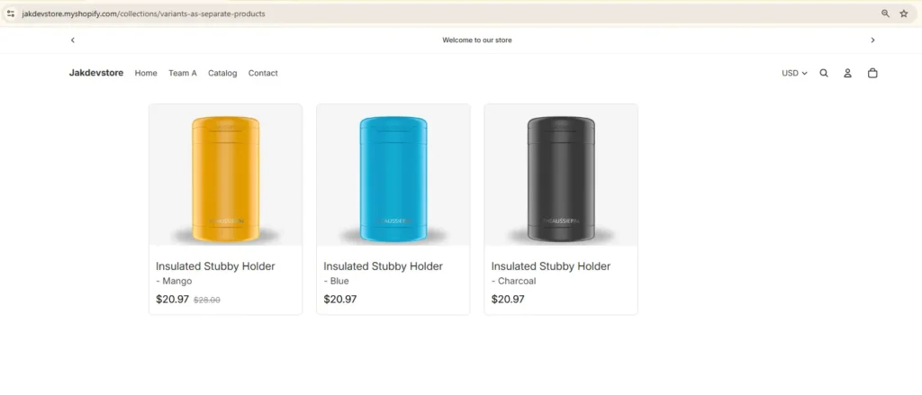
In this blog, I’m going to show you How you can show product variants as Separate product in your collection page. For this example, we’ll use the ‘Stubby Holder’ and display three of its colors. The product comes in Mango, Blue, and Charcoal.
Here is the final result.
This will work on any theme because we created a custom template that’s theme-independent. However, for this guide, we’ll use the Horizon theme as an example. The process is straightforward. We store the variants in metafields, think of it as a database, and pull the items from there to display on the collection page. That’s it. Since the procedure is simple, filtering and sorting won’t work here. We just show the variants and link each item.
Create metafields in Shopify
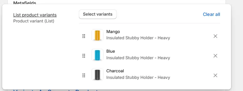
First, create the metafields. Go to Settings, then Metafields and Metaobjects, then Collections, and click Add definition. Name it “List product variants.” This name matters because we’ll need the namespace and key later. For the type, select “Product variant” and turn on “List of variants.” Save the definition.
Edit theme code in Shopify
Next step create the template . Go to online store → Click on the three dots:Edit code
Here we need to create two files. One is the collection template, and the other is the section for that template.
Create section in shopify
Let’s create the section first: Open the sections folder → right click on your mouse → new file → name it: variant-as-product.liquid
{% style %}
  .variant__as__seperate__products__wrapper {
    width: 100%;
    max-width: {{ section.settings.page_width }}px;
    margin: 0 auto;
    padding: {{ section.settings.padding_vertical }}px {{ section.settings.padding_horizontal }}px;
  }

  @media (max-width: 768px) {
    .variant__as__seperate__products__wrapper {
      padding: 0 16px;
    }
  }

  @media (max-width: 480px) {
    .variant__as__seperate__products__wrapper {
      padding: 0 12px;
    }
  }

  .variant__as__seperate__products {
    display: grid;
    grid-template-columns: repeat(auto-fill, minmax(250px, 1fr));
    gap: 24px;
    padding: 20px 0;
  }

  @media (max-width: 768px) {
    .variant__as__seperate__products {
      grid-template-columns: repeat(auto-fill, minmax(200px, 1fr));
      gap: 16px;
    }
  }

  @media (max-width: 480px) {
    .variant__as__seperate__products {
      grid-template-columns: {% if section.settings.mobile_columns == '2' %}repeat(2, 1fr){% else %}1fr{% endif %};
      gap: 12px;
    }
  }

  .variant-product-card {
    display: flex;
    flex-direction: column;
    gap: 12px;
    border-radius: 8px;
    overflow: hidden;
    transition: transform 0.2s ease, box-shadow 0.2s ease;
    border: 1px solid #e0e0e0;
  }

  .variant-product-card:hover {
    transform: translateY(-4px);
    box-shadow: 0 4px 12px rgba(0, 0, 0, 0.1);
  }

  .variant-product-card-link {
    display: flex;
    flex-direction: column;
    gap: 12px;
    text-decoration: none;
    color: inherit;
    height: 100%;
  }

  .variant-product-card-content {
    padding: 12px;
    display: flex;
    flex-direction: column;
    gap: 8px;
    margin-top: auto;
  }

  .variant-product-image {
    width: 100%;
    height: {% if section.settings.image_height_mode == 'fixed' %}{{ section.settings.image_height }}px{% else %}auto{% endif %};
    display: block;
    object-fit: cover;
    background-color: #f5f5f5;
  }

  .variant-product-card h3 {
    margin: 0;
    font-size: 16px;
    font-weight: 400;
    line-height: 1.4;
    overflow: hidden;
    text-overflow: ellipsis;
    display: -webkit-box;
    -webkit-line-clamp: 2;
    -webkit-box-orient: vertical;
  }

  .variant-product-card h3 .product-name {
    display: block;
    font-size: 19px;
    opacity: 1;
  }

  .variant-product-card h3 .variant-name {
    display: block;
    font-size: 16px;
    opacity: 0.9;
  }

  .variant-product-price {
    display: flex;
    gap: 8px;
    align-items: center;
    flex-wrap: wrap;
  }

  .variant-product-price__current {
    font-size: 18px;
    font-weight: 400;
    color: #000;
  }

  .variant-product-price__compare {
    text-decoration: line-through;
    opacity: 0.6;
    font-size: 14px;
  }

  @media (max-width: 480px) {
    .variant-product-card h3 {
      font-size: 14px;
    }

    .variant-product-price__current {
      font-size: 16px;
    }

    .variant-product-price__compare {
      font-size: 12px;
    }
  }

  .variant-pagination {
    display: flex;
    justify-content: center;
    align-items: center;
    gap: 12px;
    margin-top: 40px;
    padding: 20px 0;
    flex-wrap: wrap;
  }

  .variant-pagination-link,
  .variant-pagination-info {
    font-size: 14px;
    line-height: 1.4;
  }

  .variant-pagination-link {
    display: inline-block;
    padding: 8px 16px;
    background-color: #f0f0f0;
    border: 1px solid #e0e0e0;
    border-radius: 4px;
    text-decoration: none;
    color: #000;
    transition: background-color 0.2s ease, border-color 0.2s ease;
  }

  .variant-pagination-link:hover {
    background-color: #e0e0e0;
    border-color: #ccc;
  }

  .variant-pagination-link.disabled {
    opacity: 0.5;
    cursor: not-allowed;
    pointer-events: none;
  }

  .variant-pagination-info {
    color: #666;
  }
{% endstyle %}

<div class="variant__as__seperate__products__wrapper">
  {% liquid
    assign list_of_variants = collection.metafields.custom.list_product_variants.value
    assign items_per_page = section.settings.variants_per_page | default: 100
  %}

  {%- if list_of_variants != blank and list_of_variants != empty and list_of_variants.count > 0 -%}
    {% paginate list_of_variants by items_per_page %}
      <div class="variant__as__seperate__products">
        {%- for variant in list_of_variants -%}
          <a href="{{ variant.url }}" class="variant-product-card variant-product-card-link">
            {% if variant.featured_image %}
              <img
                src="{{ variant.featured_image | image_url: width: 400 }}"
                alt="{{ variant.title }}"
                class="variant-product-image"
                loading="lazy"
                width="400"
                height="{{ 400 | divided_by: variant.featured_image.aspect_ratio | round }}"
              >
            {% endif %}

            <div class="variant-product-card-content">
              <h3>
                <span class="product-name">{{ variant.product.title }}</span>
                <span class="variant-name"> - {{ variant.title }}</span>
              </h3>

              <div class="variant-product-price">
                <span class="variant-product-price__current">
                  {{ variant.price | money }}
                </span>

                {% if variant.compare_at_price and variant.compare_at_price > variant.price %}
                  <span class="variant-product-price__compare">
                    {{ variant.compare_at_price | money }}
                  </span>
                {% endif %}
              </div>
            </div>
          </a>
        {%- endfor -%}
      </div>

      {%- if paginate.pages > 1 -%}
        <div class="variant-pagination">
          {%- if paginate.previous -%}
            <a href="{{ paginate.previous.url }}" class="variant-pagination-link">← Previous</a>
          {%- else -%}
            <span class="variant-pagination-link disabled">← Previous</span>
          {%- endif -%}

          <span class="variant-pagination-info">Page {{ paginate.current_page }} of {{ paginate.pages }}</span>

          {%- if paginate.next -%}
            <a href="{{ paginate.next.url }}" class="variant-pagination-link">Next →</a>
          {%- else -%}
            <span class="variant-pagination-link disabled">Next →</span>
          {%- endif -%}
        </div>
      {%- endif -%}
    {% endpaginate %}
  {%- endif -%}
</div>

{% schema %}
{
  "name": "Variant as products",
  "settings": [
    {
      "type": "range",
      "id": "page_width",
      "label": "Page Width",
      "min": 800,
      "max": 1600,
      "step": 50,
      "unit": "px",
      "default": 1200
    },
    {
      "type": "header",
      "content": "Padding"
    },
    {
      "type": "range",
      "id": "padding_vertical",
      "label": "Top & Bottom",
      "min": 0,
      "max": 100,
      "step": 5,
      "unit": "px",
      "default": 0
    },
    {
      "type": "range",
      "id": "padding_horizontal",
      "label": "Left & Right",
      "min": 0,
      "max": 100,
      "step": 5,
      "unit": "px",
      "default": 20
    },
    {
      "type": "header",
      "content": "Image"
    },
    {
      "type": "select",
      "id": "image_height_mode",
      "label": "Image Height",
      "options": [
        {
          "value": "auto",
          "label": "Auto (Keep Aspect Ratio)"
        },
        {
          "value": "fixed",
          "label": "Fixed Height"
        }
      ],
      "default": "fixed"
    },
    {
      "type": "range",
      "id": "image_height",
      "label": "Fixed Height",
      "min": 150,
      "max": 500,
      "step": 10,
      "unit": "px",
      "default": 250,
      "visible_if": "{{ section.settings.image_height_mode == 'fixed' }}"
    },
    {
      "type": "header",
      "content": "Pagination"
    },
    {
      "type": "number",
      "id": "variants_per_page",
      "label": "Variants Per Page",
      "default": 100,
      "info": "Number of variants to show per page. Pagination appears when exceeded."
    },
    {
      "type": "header",
      "content": "Mobile Layout"
    },
    {
      "type": "select",
      "id": "mobile_columns",
      "label": "Mobile Columns",
      "options": [
        {
          "value": "1",
          "label": "1 Column"
        },
        {
          "value": "2",
          "label": "2 Columns"
        }
      ],
      "default": "1"
    }
  ]
}
{% endschema %}Create collection template in shopify
Let’s create the template. Open the templates folder, then right-click or create a new file from the menu. Name it: collection.variants-as-products.json
{
  "sections": {
    "main": {
      "type": "variant-as-product",
      "settings": {}
    }
  },
  "order": [
    "main"
  ]
}Last step. Let’s assign the variant to the metafield. Open the Products tab → then click on Collections → create a collection and name it whatever you like for instance : Variants As Separate Products.
Here we have to do two things. First, select the items you want to show in your collection page. Second, assign the collection template we created earlier. I’m going to list 3 items for now and change the template. Let’s view the collection.
There are settings for the section that you can change. To do that, edit the theme → click on Collections → choose the template we created → here is our section.
You can change the page width, add spacing on the top and bottom, and left and right. You can adjust the image height, change the columns on mobile, and most importantly set pagination. If you have more than 50 items, we recommend enabling pagination.
How does it work? You set a number, and the customer will only see that many items. For example, if you set it to 2, it will load only two items. To see more, they’ll have to go to the second page.